Brandkit Brand Identity
Brand name: Brandkit™
Taglines: "Home for your brand", "A beautiful home for your brand"
Domains: brandkit.com, brandkitapp.com, brandkit.io, brandkit.co.nz, brandkit.com.au, brandkit.co.uk, brandkit.app
Our Mission: Make the world better, by helping every brand be an Authentic Brand.
Our Vision: Every brand has an easy to access library of authentic brand content and knowledge to aid their story telling.
Our Core Values: Brands matter, People matter, Honesty, Authenticity, Trustworthiness, Simplicity/Less is more, Aesthetics matter, Respect the special uniqueness of each brand/customer, Be smart, Zag/Challenge the status quo, Value our own expertise
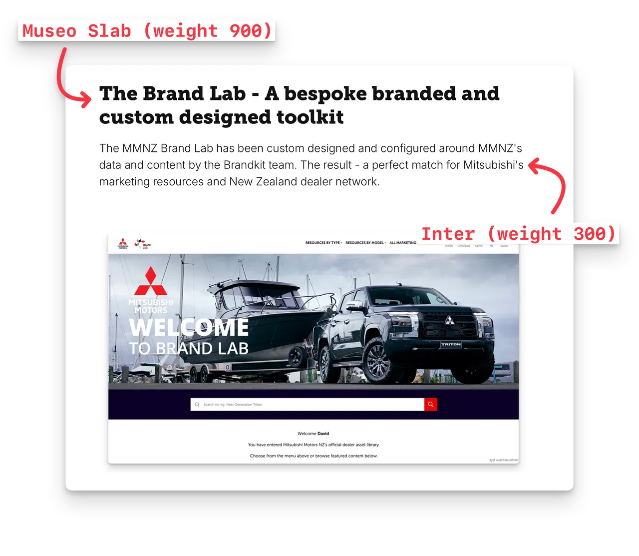
See more Brand Guidelines here.