Brand Portal Design Guidelines
This guide is intended for Brandkit customers and their graphic designers or web developers, when considering a custom design for your Brand Portal on the Brandkit platform.
For context, this process relates to the Custom Design options for customers on the Pro and Enterprise editions of Brandkit.
This is not intended as a comprehensive guide on How to “code” a custom Portal, it is instead intended as a guide to help customers visualise their desired Brandkit Portal UI. Once you furnish us with your requirements an/or a visual UI design, the Brandkit team will code your custom pages and configure your account to support your UI and Nav structure.
Read this in conjunction with this page on Custom Design and we recommend that you take a tour of the Brandkit platform, so you get to see all the options available to you.
A typical custom portal
Let’s take a look at the default design and then some custom Portals to start with.
Default Design
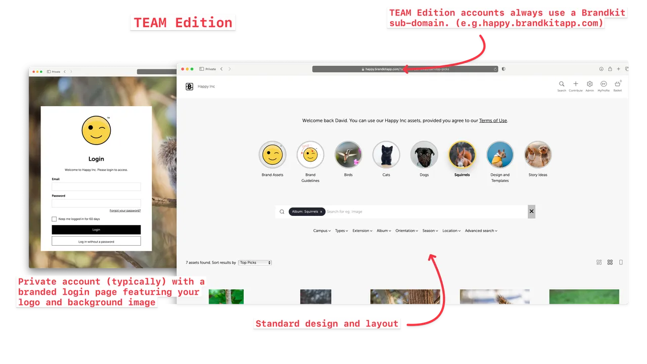
(Fig 1. Team Edition layout and design)
This is the default design before any customisation - showing an intro text section, followed by standard Albums section with the Horizontal layout option selected, in turn this is sitting above a standard Search Grid section.
Note that the Brandkit icon is shown with your account name next to it. The Login page of this private account (shown above in Fig 1 on the left) displays your logo and background image.
Panorama
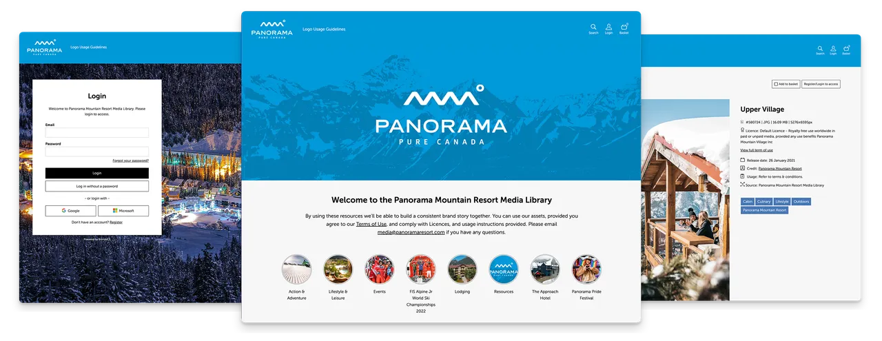
(Fig 2: Screenshots from Panorama Mountain Resort Media Library)
Panorama Mountain Resort in Canada is a smallish account with a simple site structure, but has some nice strong branding with a blue nav bar and an integrated brand image background on the home page. This is possible because Brandkit support both a CSS theme file, page specific CSS and in-line CSS.
In this case page specific CSS is used on the home Portal landing page (home page) to blend the first logo section with the nav bar. Nice.
This Portal also features standard Albums with the Horizontal layout option selected, sitting above a standard Search Grid. Note that in this case Panorama opted for the home page to also be the Search page (search results appear below the Albums and Search box on the home page).
Visit Wales
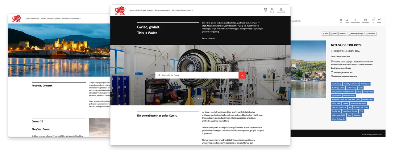
(Fig 2: Screenshots from Visit Wales brand toolkit)
Visit Wales is a more sophisticated and customised Brand Portal, and is Bi-Lingual supporting both English and Welsh** languages.
Bi-lingual, or multi-lingual Brand Portals are available on the Enterprise edition are created by:
- The Brandkit team adding a Locale for your preferred languages or locales.
- The Brandkit team translating all the interface UI and app language for any new languages (Brandkit currently supports English, German, French, Spanish and Welsh).
- You (the customers) supply any content and copy for the Brand Portal UI in all required languages (i.e. customer translates their own content).
- When building/coding pages in the CMS add duplicate sections for each Language variation, and use the Locale selector in the page settings to wire up section display with Locale selections by users.
- Alternatively use single sections for all languages, but use Mustache variables in the HTML code to display in-section blocks to wire up block display with Locale selection by users.
Mitsubishi Motors
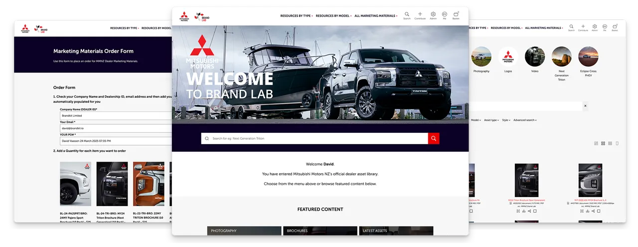
(Fig 3: Screenshots from Mitsubishi Motors Brand Lab)
Mitsubishi Motors NZ Brand Lab is a Brandkit design to distribute brand and marketing materials to franchised Mitsubishi new motor-vehicle dealerships. These marketing materials include photography, video, advertising, download digital brochures and also an order form for dealers to order physical printed version of brochures, and other physical collateral.
This order form is a custom build, and integrates an external form builder (Wufoo forms) embedded in a Brandkit CMS page, that send orders placed by dealers to the Mitsubishi Motors parts ordering system via email, MMNZ then automatically updates each dealers regular parts order for delivery to the dealership.
This Portal is an example of a comprehensive custom design and build incorporating design elements, but also custom functional elements (integrated order form).
Customisation Basics
Responsive Design
Pixel perfect designs are out. Brandkit Portals are always responsive to device size and should gracefully reformat for different screen sizes using standard Screen breakpoints.
We have adopted the following break points that can be seen on our base system CSS and default CSS Theme.
- 36em/57.6rem phone (Small devices (landscape phones, 576px and up)
- 48em/76.8rem tablet (Medium devices (tablets, 768px and up)
- 62em/99.2rem desktop (Large devices (desktops, 992px and up)
- 75em/120rem large desktop (Large devices (desktops, 1200px and up)
- 120em/192rem Pro/designer desktop (Large devices (desktops, 1920px and up, e.g. most pro design screens)
Page structure
All pages in the Brand Portal are built on top of a Layout. A Layout is an HTML page consisting of sections. By default all CMS pages start with 4 sections:
- Navbar
- Announcements
- Page Content
- Footer
Navbar
The Header Navbar is made up of three sub-sections:
- Logo - the Brandkit icon by default - you can add your own logo via the Portal Settings (Admin > CMS > Portal(s) > Portal Settings) and adjust sizes etc in your Themes file (Admin > CMS > Themes > Your theme > Navbar)
- The left navbar - empty by default - you can add menu items here (see below),
- The right navbar - this is the User Actions Nav and cannot be edited at all. You can hide certain actions and icons, but we strongly recommend you do not, because these are important functional buttons for the system.
You can edit the Navbar in the Layout and add simple anchors to pages (e.g. /contact) or dynamic searches (e.g. /assets?tag=Waterfall). We also provide a nav code snippets example, which you can copy and paste into the Navbar code input.
Here are some nav item code snippets:
<!-- basic page link -->

<a href="/albums" title="View {{Account.name}} asset albums">Albums</a>

<!-- link to assets of type -->

<a href="/assets?type=Image" title="View {{Account.name}} images">Images</a>

<!-- direct link to live asset -->

<a href="/asset-page/link-to-asset" title="View {{Account.name}} Brand Guidelines">Brand Guidelines</a>

<!-- dropdown menu item -->

<div class="dropdown-menu-item dropdown-js">
<button class="dropdown-button dropdown-button-js">
<!-- button text -->

    <span>Platform</span>
<!-- caret icon - do not edit -->

    <span class="css-icon css-icon-caret-down"></span>
</button>
<!-- dropdown menu content -->

    <div class="dropdown-content dropdown-content-js platform">
<!-- example links to albums -->

      <a href="/assets?album=Antivirals">Antivirals</a>
      <a href="/assets?album=Business">Business</a>
      <a href="/assets?album=Hospitality">Hospitality</a>
    </div>
</div>
<!--END dropdown menu item -->
Announcements
This section is reserved for system announcements - do not touch
Page Content
This section is the body of your web pages and it is where the Page content is injected in the layout.
Footer
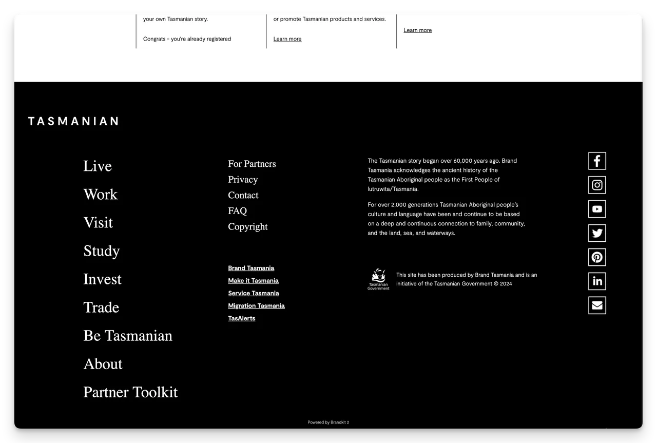
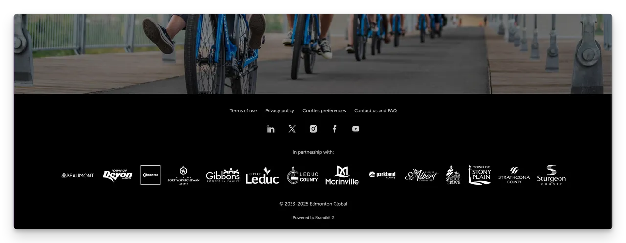
The page footer is a bit more open and you can either leave it as default. You’ll get links to Terms of use, Privacy Policy and Cookies policy pages, a copyright statement (with automatic date range from the year your account was created until the current year) and a Powered by Brandkit link centered at the bottom.
If you prefer, you can change this design and it is pretty flexible from background colors/colours to links and logos.
However, the Powered by Brandkit link will always appear and is outside the editable footer area. You can style this (e.g. text color in your Theme).
Here’s a couple of Footer examples:
CSS Theme
All Brandkit Portals use a base system CSS plus a Theme file. The Default theme (visible in the CMS > Themes are used initially.
All Pro Edition and Enterprise Edition accounts have the ability to use a custom CSS Theme.
You use your theme file to write custom CSS code and upload custom Fonts in order to customise the look and feel of your Brandkit Brand Portal.
Themes do not impact the Admin area, which is normalised across all customer accounts.
We recommend you start with the Default theme and modify it. It’s most likely that during onboarding the Brandkit team has already created a theme for you, based on the default theme.
Custom Domain (URL) and Hosts
All Pro Edition and Enterprise Edition accounts can have a custom domain (web address/URL).
This needs to be added to your account by Brandkit staff - but once added you will see it alongside the default your-abbreviated-name.brandkit.com domain.
You can choose to support multiple domains, or redirect traffic to one domain.
Code Blocks for common layouts
We provide a series of code blocks for some commonly used layout elements. These are available for copy and paste, directly when editing. Page section in the CMS.
Here is a list of these
- Two column section
- Three column section
- Four column section
- In-line video
- In-line brand guidelines PDF
- Collapsible/Accordion section
- Collapse All Header
- Contact page intro example
-
FAQ (uses the web standard List elements
<dl>,<dl>and<dt>
Use Mustache Variables for Personalization
You can use Mustache Variable in your pages to display dynamic text from the system data.
e.g. you can display a logged-in user’s name in a page, section or email using the variable {{user.first_name}}.
A list of Variables and Instructions on usage is available above the HTML input in pages.
Mustache Variables are indicated by double mustaches {{}}.
Examples:
Account information
Account name: {{Account.name}}
Account legal name: {{Account.legal_name}}
User information
Current user full name: {{User.name}}
Current user first name: {{User.first_name}}
Current user last name: {{User.last_name}}
Current user company: {{User.company}}
Current user contact number: {{User.contact_number}}
Current user job title: {{User.job_title}}
Current user industry: {{User.industry}}
Current user country: {{User.country}}
Current user city: {{User.city}}
Current user email: {{User.email}}
Current user role: {{User.role}}
Current locale: {{User.locale}}
Sections are used to render a block of HTML.
They need to be opened {{#}} and closed {{/}}. Examples:
{{#en}}
This is shown when current locale is “en” (English)
{{/en}}
{{#es}}
Esto se muestra cuando el locale actual es “es” (Español)
{{/es}}
{{#User.logged_in}}
Only show this if current user is logged in
{{/User.logged_in}}
Roles:
{{#Role.System-admin}}
Only show this if current user is system admin
{{/Role.System-admin}}
{{#Role.Staff}}
Only show this if current user has role Staff
{{/Role.Staff}}
{{#Role.Standard-Subscriber}}
Only show this if current user has role Standard Subscriber
{{/Role.Standard-Subscriber}}
{{#Role.Reseller}}
Only show this if current user has role Reseller
{{/Role.Reseller}}
{{#Role.Customer}}
Only show this if current user has role Customer
{{/Role.Customer}}
{{#Role.Public-user}}
Only show this if current user has role Public user
{{/Role.Public-user}}
{{#Role.SEO-Agency}}
Only show this if current user has role SEO Agency
{{/Role.SEO-Agency}}
{{#Role.Owner}}
Only show this if current user has role Owner
{{/Role.Owner}}
{{#Role.Admin}}
Only show this if current user has role Admin
{{/Role.Admin}}
Role Groups:
{{#RoleGroup.Brandkit-Team}}
Only show this if current user is in role group: Brandkit Team
{{/RoleGroup.Brandkit-Team}}
{{#RoleGroup.Logged-in-users}}
Only show this if current user is in role group: Logged in users
{{/RoleGroup.Logged-in-users}}
{{#RoleGroup.Public-Users-(Not-Logged-in)}}
Only show this if current user is in role group: Public Users (Not Logged in)
{{/RoleGroup.Public-Users-(Not-Logged-in)}}
**Use {{^}} to render block of HTML if condition is not met.
{{^User.logged_in}}
Only show this if current user is NOT logged in
{{/User.logged_in}}
Avoid this
We can pretty much customise the whole UI with one exception.
The User Actions Menu This small icon rich menu site on the top right of the Navbar, When logged in this area includes standard functions: Basket Open, My Profile, Link to Admin (if you are an Admin), Optional Contribute button, Search page. When logged out it displays the Login link.
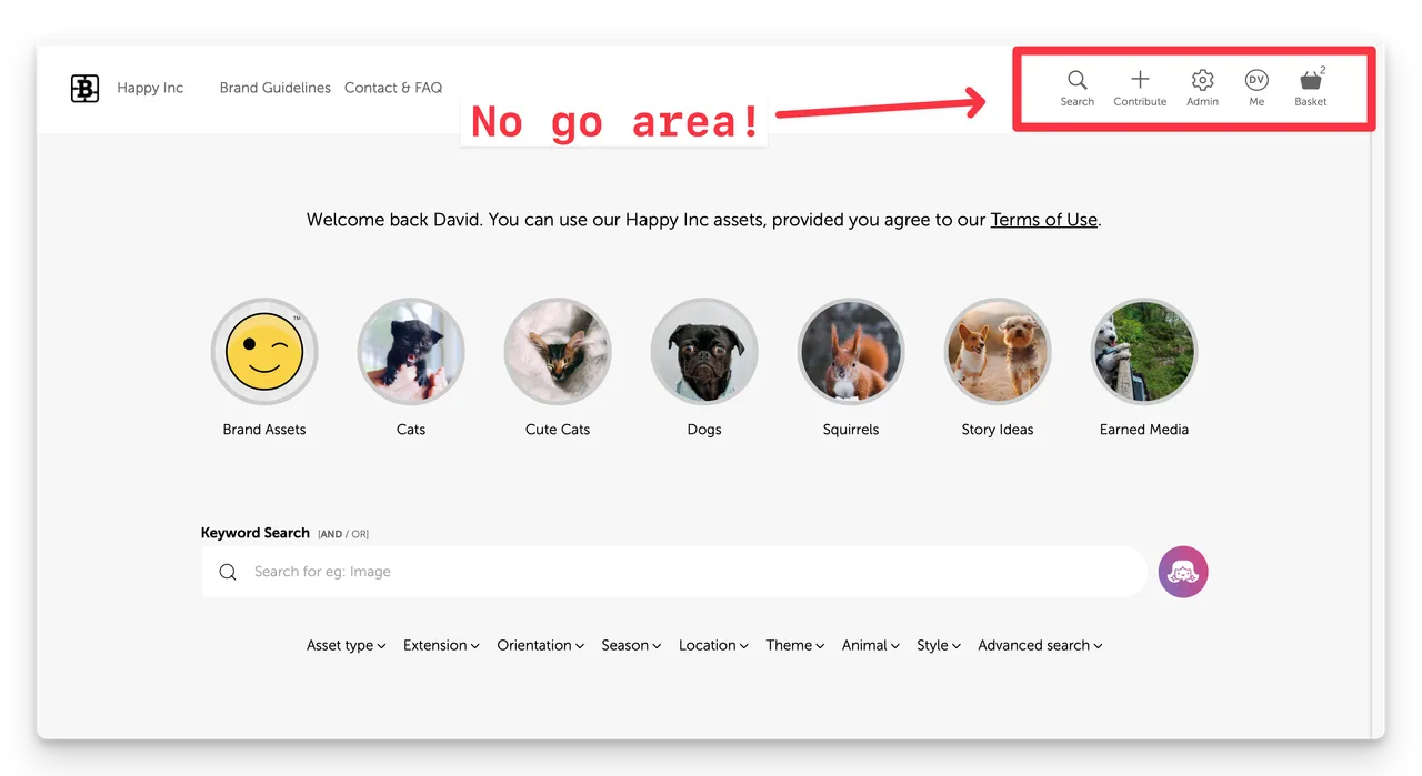
(Fig. Stack of Screen shots of Mobile Phone size showing the User Actions Menu at the top right)
You must not alter the User Action Menu placement, position or size. This is vital for site operations like logging in, search, editing user profile, logging out, Basket access and more.
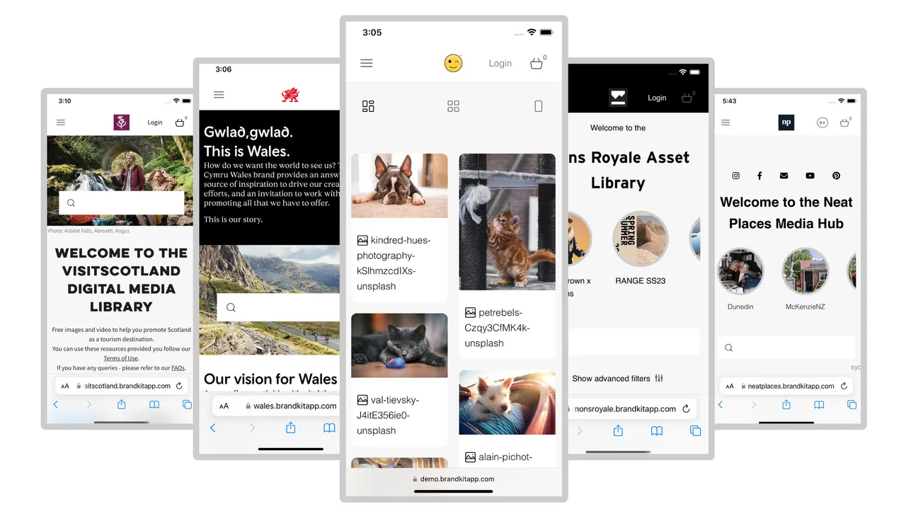
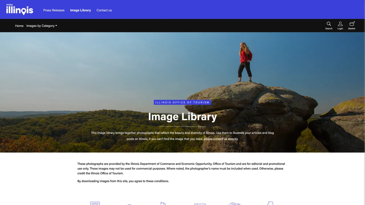
Sometimes this is inconvenient, so there is a workaround where you can add a new section to your Portal Layout and call it something like Upper-Nav or Over-Nav. You can then add additional text, links etc in that space. Here’s an example from Illinois Tourism’s Brandkit powered Image Library.
Smart sections
There are also no-go areas in certain smart sections depending on the functionality. For example, you cannot really change the structure and layouts of Search Results grids without a lot of additional work, and even then see unintended consequences.
That said…
It is still possible to hide elements of or the whole User Actions Menu using CSS display:none. This can be done site wide or on a page by page basis.
Talk to your Brandkit contact if you are unsure, or need assistance.
Editable Default pages
All new accounts have a default home page (“/index”) that you can edit the CMS. This page has 3 standard sections, (you can add more).
- Intro (HTML)
- Albums (Album type section)
- Search Grid (Search Grid type section)
You can modify and re-order these or, add new sections to any page.
Special Brandkit smart sections
Brandkit’s CMS features several smart sections, These are pre-built sections deeply integrated into the DAM (Asset Library) functionality of the Brandkit platform.
These sections are:
- HTML - a plain HTML section
- Feed - a section that inserts a basic unstructured feed of the latest assets in chronological order.
- Albums - a section that displays selected Albums in one of two layouts
- Search Box - a section that displays a search box over a background image that links to a separate page for search results
- Search Grid - a section that includes a Search box, Search Filters and a Search Results Grid grouped in one section.
- Credits - a section that displays a grid of Credits with links to a dedicated search page for each Credit.
- Carousel - a section that displays multiple hero images/banners that animates between images. Optionally with a Search box and title overlay/Links to a separate Search Results page, typically.
- Advanced - used by Brandkit staff to add custom system integrations.
Non Editable Standard system pages
There are some standard system pages that you cannot edit directly - but you do have some selectable options in Settings.
Login page
The Login page cannot be modified directly, but you have some options.
- Change overall styles, colours, fonts in your design theme (Admin > CMS > Themes > Wall) and be sure to apply the new theme in your Portal Settings (Admin > CMS > Portal(s) > Portal Settings>)
- Add a Logo to be used in the Login screen in your Portal Settings (Admin > CMS > Portal(s) Portal Settings - Portal Wall Logo). This logo is also used in your Share Landing pages when the user is logged out.
- Add a Background Image to be used in the Login screen in your Portal Settings (Admin > CMS > Portal(s) Portal Settings - Portal Wall Background). This background is also used in your Share landing pages, when the user is logged out.
- Add custom welcome copy to the login screen in your Portal Settings - Portal Wall Copy (Admin > CMS > Portal(s) Portal Settings - Portal Wall Copy)
- Turn on Authentication options such as Passwordless Login, SSO and Register links and CAPTCHA in your User Authentication settings (Admin > Settings > User Authentication). Please note: If you allow self-register by users, you should ALWAYS add a CAPTCHA.
Register page
The Register page cannot be modified directly but you have some options.
- Uses the same styles as the login page
- Uses the same logo as the Login page
- Uses the same background image as the Login page
- Add custom register copy to the register screen in your Portal Settings - Portal Wall Copy (Admin > CMS > Portal(s) Portal Settings - Portal register form copy)
2 Factor page
The 2 Factor page cannot be modified directly but you have some options.
- Uses the same styles as the login page
- Uses the same logo as the Login page
- Uses the same background image as the Login page
- There is no custom copy option for the 2 Factor page.
Editable Standard system pages
There are some standard system pages that you can replace with a custom page.
Terms of use (“/terms”)
To modify the Terms of Use page.
In the CMS - create a new page named “terms”, and copy the existing terms of use page HTML into it and then edit as you see fit. Once a new terms page is added it will automatically replace the default terms page.
Privacy Policy page (“privacy-policy”) and Cookies page (“/cookies”).
To modify the default Privacy Policy page and/or the default Cookies page create new pages in the CMS (same as above for the Terms of use page). Just ensure you name the new pages exactly the same as the default pages and they will be used automatically instead of the defaults.
Get Support
The Brandkit team is well versed in custom design and layouts - after all 95% of our customers have a customisation of some sort,
Contact the team or book a support call from our Contact page.
Brand Portal Design Guidelines
This guide is intended for customers and their graphic designers, when considering a custom design for your Brand Portal on the Brandkit platform.