Q. What is the difference between a logotype, logomark, and logo lockup?

Your logo is often the first impression people have of your brand. It’s not just a graphic — it’s a symbol of identity, values, and trust. But “logo” is a broad term, and in branding we break it down into three core types: logotype, logomark, and logo lockup.
Understanding the difference helps you make better decisions about how your brand shows up in the world. Let’s look at each type and what role they play in brand identity.
Logotype
A logotype is a logo built around your brand’s name or initials. It’s text-based — sometimes called a wordmark or lettermark — and it puts the focus directly on the name of your brand.

Logotypes are clear, timeless, and excellent for building name recognition. They eliminate confusion and make sure your brand is easily understood at a glance. Think of iconic wordmarks like Google or Coca-Cola.
The main creative element in a logotype is typography. While this can feel limiting, strong type design can communicate a lot — whether that’s tradition, innovation, or personality.
For new brands, logotypes can be especially effective in driving awareness and clarity.
Logomark
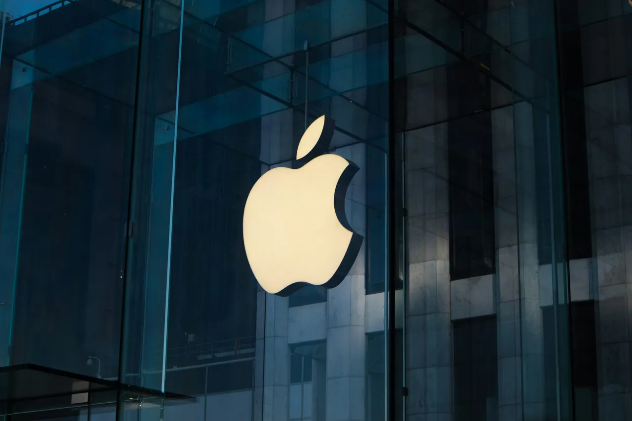
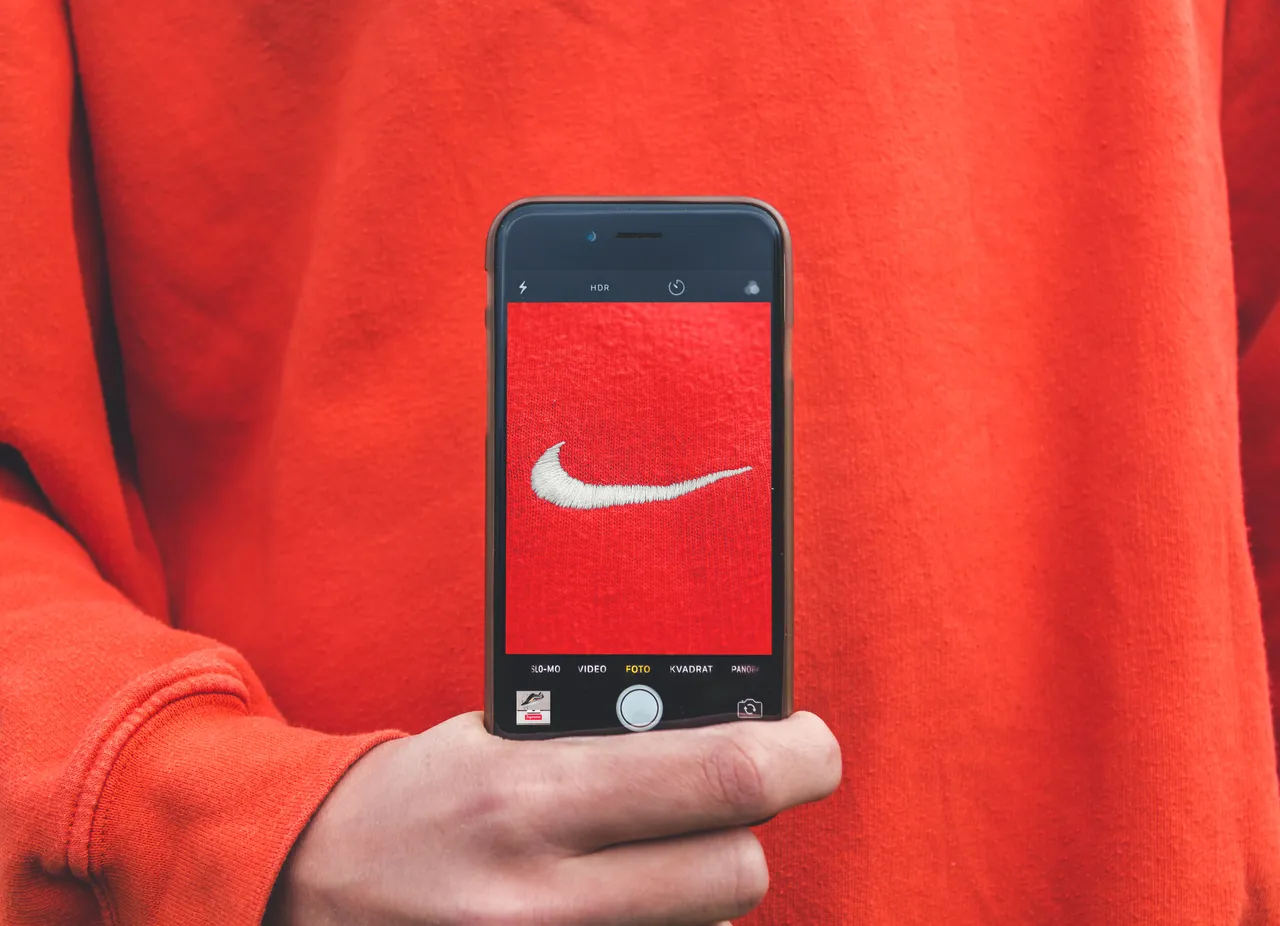
A logomark is a purely visual symbol — a graphic or icon that represents your brand without words. The best logomarks are simple, memorable, and loaded with meaning. Think of the Apple symbol or Twitter’s bird or Nike’s Swoosh.

(Fig: Nike’s Swoosh (logomark) can stand on it’s own and we see it and think “Nike”)
Logomarks work because imagery is powerful. They can carry emotion, suggest an industry, or symbolize a concept in an instant. The style of your logomark — sharp lines, soft curves, geometric shapes — affects how people perceive your brand’s tone.
A strong logomark can eventually stand alone, but usually only after your brand is well-established and recognized. This will typically take years and a lot of investment to establish the logomark in the minds of your audience.
Logo lockup
A logo lockup combines both a logotype and a logomark into a single system. It might be your brand name paired with an icon, sometimes along with a tagline or descriptor.

Lockups are flexible — they give you both the clarity of a name and the distinctiveness of a symbol. Many brands start with a lockup so they can build recognition across different contexts. Over time, they may simplify and use either the logotype or logomark on its own.
Which one is right for your brand?
There’s no single “best” choice—it depends on your brand’s stage, industry, and goals. A logotype builds awareness, a logomark creates symbolism and visual power, and a lockup gives you versatility.
The most important thing is consistency. Once you choose your system, stick with it and use it consistently across every touchpoint. That’s how logos turn into brand assets with real equity.

Need advice
At Brandkit, we help organizations design, manage, and scale brand systems that last.
Additional reading
- Logomarks: 6-famous-textless-logos-and-why-they-work
- Logo Lockup example: [MIT Brand Guide](https://brand.mit.edu/logos-marks/logo-lock-ups
Just starting out in design
Understanding what a logotype is and how it’s created can also be valuable for aspiring designers eager to build a successful career. Learning how typography, form, and brand identity work together strengthens visual communication skills and helps you stand out in the field.
Those looking to start their journey can explore job opportunities for graphic designers —many of which welcome applicants with no experience, to gain practical insights and apply their creative knowledge in real projects.
Find job opportunities for graphic designers with no experience - at Jooble.
Happy branding :)
Q. What is the difference between a logotype, logomark, and logo lockup | Brandkit
Discover the difference between logomark vs logotype vs logo lockup and how each plays a role in shaping your brand identity.
