Brandkit brand: Typography
Brandkit is always written as one word, with an uppercase 'B', and a lower case 'k'. It should never be written as two words or with an upper case 'k'.
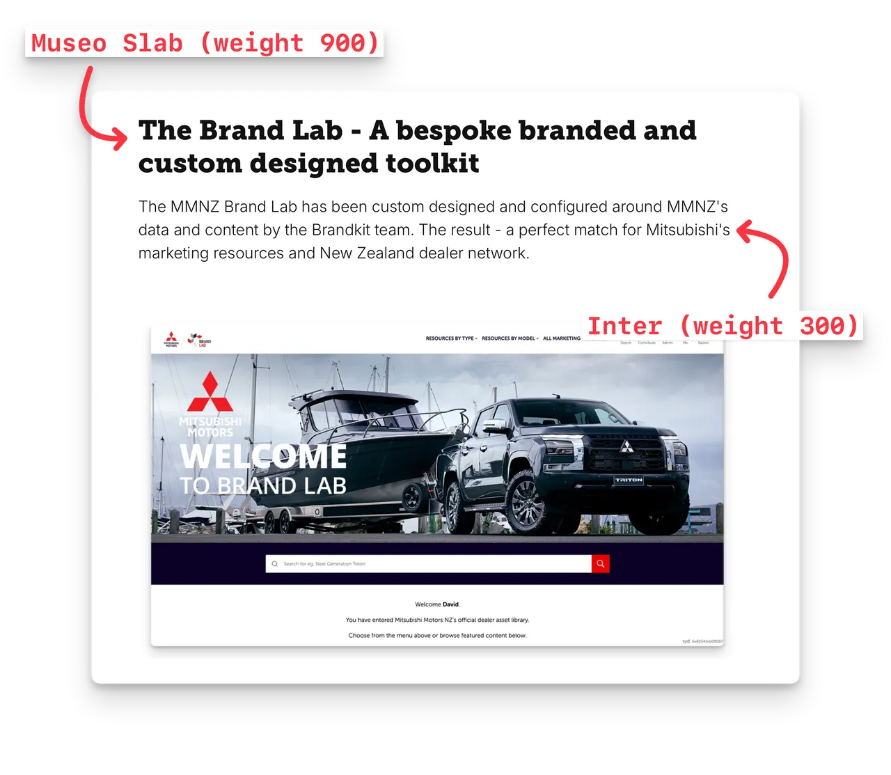
Museo Slab is the typeface that the Brandkit wordmark is based on, and it is also used for heading and titles. Museo Slab is from the Exljbris Font Foundry and can also be found and available at Adobe Fonts.
Starting in 2023, to celebrate the launch of Brandkit 2, we have selected Inter for body copy.
Inter is a variable font family created by renowned Swedish designer Rasmus Andersson. The font was crafted specifically for computer screens to enhance the legibility of small text sizes. It was first released on August 20, 2017, and was initially known as Interface. It is also regarded as a "neutral" typeface, and a good match for our desire for the Brandkit® brand to be a neutral low key backdrop for each of our customers' brand and content.
Inter is available from both Google Fonts, and Adobe Fonts.
So to recap:
- Museo Slab (Weight = 900) for Headings and Titles
- Inter (Weight = 300) for body copy
Example usage
See more Brand Guidelines here.