Why Figma (and other design tools) Is Making Your Website Fat
There's a quiet tension running through most web design workflows today, and it costs teams time, money, and maintainability every single day. It lives in the gap between what a designer sees in Figma and what a developer actually ships to a browser — and it's bigger than most people realise.
Designed for a World That No Longer Exists
To understand the problem, you have to understand where these tools came from.
Adobe's suite — Photoshop, Illustrator, InDesign — was built for print. Fixed dimensions. CMYK colour. Exact typography locked to a static page. The paradigm is simple: you design something, it gets printed, it never changes. The output is physical. It doesn't reflow. It doesn't respond. It doesn't adapt.
Figma came later and brought a more collaborative, screen-focused approach. But it still inherited much of that DNA. You're working with fixed-width frames, precise pixel measurements, and a visual canvas that represents one snapshot of a design — not the fluid, contextual, infinitely variable thing that a web page actually is.
Canva sits in a similar camp, optimised for social media graphics and marketing collateral — again, essentially static output. These are tools built for the world of print, repurposed for a medium that works fundamentally differently.
The web is not a page. It's a system.
The Grid Trap
Column-based grid systems look great in a design tool. They feel organised and rational. Twelve columns, consistent gutters, everything snapping into place. Designers love them — and for good reason, they're a powerful compositional framework.
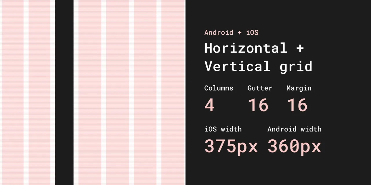
But here's where things go wrong. When developers are handed a pixel-perfect comp built on a rigid 12-column grid, they often reach for a CSS framework — Bootstrap, Foundation, or a utility-class system like Tailwind — to replicate that structure in code. Suddenly you're loading hundreds of kilobytes of CSS to express something that, done natively, might take twenty lines.
Modern CSS already has a grid system built in. It's called CSS Grid. It's native, it's powerful, and it doesn't require a framework. Combine it with Flexbox and you can express almost any layout with clean, semantic, maintainable code. But when a developer is working to match a Figma file exactly, they often reach for the familiar rather than the appropriate.
The result: bloated stylesheets, unnecessary specificity wars, and CSS that fights the browser instead of working with it.
Fixed Thinking in a Fluid Medium
The deeper issue is philosophical. Print thinking assumes a fixed canvas. Web thinking requires fluid, responsive, contextual design — something that looks right on a 4-inch phone screen, a 13-inch laptop, a 27-inch monitor, and everything in between.
When a designer hands over a comp with precise measurements for every element, they're implicitly asking the developer to recreate a static artefact. But that's not how the web works. The web reflows. It adapts. Elements need to grow, shrink, stack, and reorganise based on context.
Trying to force print-paradigm precision onto a fluid medium creates complexity. Developers write breakpoint after breakpoint trying to wrangle a fixed design into responsiveness. CSS grows and grows. And the further you get from the original comps, the harder it becomes to maintain.
The Real Cost
The hidden cost of this mismatch shows up in a few places:
Performance. Bloated CSS frameworks, over-engineered grid systems, and redundant utility classes add weight to every page load. Users on slower connections pay the price.
Maintainability. When code is written to match a design rather than to express intent, it becomes brittle. Change the design, and developers have to unpick layers of CSS specificity to follow.
Developer experience. Working against the grain of a medium is demoralising. Skilled front-end developers know how clean native HTML and CSS can be — and it's frustrating to produce something needlessly complex.
Design debt. Over time, the gap between "what's in Figma" and "what's in the browser" widens. Designers update comps; code doesn't follow. Teams end up with two sources of truth, neither fully accurate.
A Better Way to Work
None of this means design tools are bad. Figma is genuinely excellent for visual communication, collaboration, and exploring ideas quickly. The problem isn't the tool — it's the workflow assumption that the design comp is the destination rather than a starting point.
The best teams treat Figma files as conversation starters, not contracts. Developers are given the intent — the visual language, the spacing principles, the typographic hierarchy — and then trusted to implement it in ways that work with the browser, not against it.
That means embracing native CSS features: custom properties, Grid, Flexbox, clamp() for fluid typography, container queries. It means writing semantic HTML that makes sense to the document, not just to the visual layout. It means being willing to let go of pixel-perfect precision in favour of something that's actually maintainable and performant.
What To Do Instead
If design tools are the problem, what's the solution? It's not to abandon visual thinking altogether — it's to radically rethink the order of operations and the fidelity of your process.
Start With a Napkin, Not a Mockup
The best web projects start ugly. A photo of a whiteboard. A rough sketch on paper. A napkin drawing. These low-fidelity artefacts are where real thinking happens — because they force you to focus on structure and intent, not aesthetics.
When you sketch a layout by hand, you're asking: what goes here, and why? What does the user need to see first? What's the hierarchy of information? These are the right questions. They can't be answered in Figma, because Figma rewards you for making things look good before you've proven they're the right things.
Low-fidelity wireframes — whether on paper, a whiteboard, or a simple tool like Balsamiq or even a rough unstyled Figma — serve a completely different purpose than high-fidelity mockups. They communicate intent without creating false precision. They invite feedback on structure rather than feedback on colour choices. And critically, they don't take long enough to build that anyone's attached to them.

The mantra is simple: stay ugly for as long as possible. The moment your wireframe starts looking polished, you've started making design decisions you should be making in code.
Content First — Always
Most website projects start with design and fail. The designer opens Figma and gets to work before a single word of real content has been written. This is the fundamental mistake — and it's everywhere.
As the team at Brandkit argue convincingly in their piece Your Website Project Is Starting in the Wrong Place: design without content is decoration. When you design around placeholder text, you're optimising for Lorem Ipsum. When real content arrives — with its awkward lengths, its nuance, its hierarchy — it doesn't fit the design you built. So the design gets compromised. Or the content gets trimmed to fit. Either way, the user loses.
What users actually want from your website is almost always mundane: your phone number, your address, your booking page, your product catalogue, an answer to a specific question. Start there. Map out the real content you have, and the real content you need to create, before anyone opens a design tool. The layout should be shaped by the content — not the other way around.
This also matters enormously for AI discoverability. Your website now has two audiences: the humans who visit it, and the machines that read it. If your website is a beautiful shell with thin content — long on hero images and short on substance — the humans struggle to find what they need, and the machines have nothing useful to learn from you. A content-first approach solves for both.
Go Straight From Lo-Fi to Code
Here's the workflow shift that makes the biggest difference: once your low-fidelity sketches are agreed on, skip the high-fidelity render entirely and go straight to code.
This sounds radical. It isn't. It's how the best front-end developers have always worked, and it's increasingly how mature product teams operate. A developer who understands the web can take a rough sketch, a style guide, and a content brief — and produce something in the browser that's more accurate to the final product than any Figma file ever was. Because the browser is the canvas. Code is the medium. A PNG of a website is neither.
Building in code from the start means you discover real problems early: how text wraps at different screen sizes, how images actually load, how interactions feel in context. You get a living, responsive, testable thing — not an illusion of one.
It also forces good decisions. You can't fake responsiveness in code the way you can in Figma. You have to solve it. And solving it properly, natively, in CSS, produces leaner, more maintainable output than any design-tool-to-framework pipeline.
The High-Fidelity Client Problem
There's an elephant in the room here, and it's called "the client wants to see what it looks like before we build it."
This is understandable. Clients are often non-technical. They can't read a wireframe and extrapolate a finished website. They want confidence before they commit budget. And so the design-first, high-fidelity mockup cycle gets justified as a sales and approval tool, even when everyone on the team knows it causes problems downstream.
There are better ways to handle this.
Style tiles instead of page mockups. A style tile shows a client the visual language — typography, colour palette, button styles, heading treatments, image tone — without locking in a page layout. It answers "what will it feel like?" without creating a false contract about "what will it look like exactly?" It's faster to produce and much easier to iterate on.
Annotated lo-fi wireframes with a design language overlay. Show the structure in a wireframe, and separately show the design language in a style tile. Present them together. Most clients, once they understand the distinction, are completely comfortable with this — especially if you frame it clearly as "here's the blueprint, here's the aesthetic direction."
Build a real prototype, not a picture of one. If the client needs to see something interactive, build a rough coded prototype rather than a Figma clickthrough. It takes similar effort, but it's actually the thing — and it forces real decisions from the start.
Set expectations early. The clearest solution is the conversation you have at project kickoff. Explain why high-fidelity mockups create expensive problems: content that doesn't fit, layouts that break responsively, CSS written to match a picture rather than to solve a problem. Most clients, when they understand the cost, are willing to try a different process — especially if you can show them examples of cleaner, faster results.
The goal isn't to deny clients visibility. It's to give them visibility into the right things at the right time — content, structure, and design language early; the finished experience in the browser, not in a PNG.
The Shift We Need
The web has grown up. Its native tools — HTML, CSS, and the browser itself — are extraordinarily capable. You don't need a framework to build a responsive grid. You don't need a plugin to export clean code. You need developers who understand the medium and designers who are willing to design for it, not despite it.
The print paradigm had its time. It built the early web. But we live in a fluid, multi-device, performance-conscious world now — and our tools and workflows need to catch up.
The best web design isn't designed to look like a poster. It's designed to behave like a system.
Have thoughts on how your team bridges the gap between design tools and code? We'd love to hear how you're working through this in your own workflow.
Why Figma Is Making Your Website Fat
Is Figma making your website slower and harder to maintain? Discover why design tool workflows create bloated code — and what to do instead.